Booksy
Overview
Adding a payment feature to the Booksy app, an app that allows users to search for and book appointments with personal care service providers.
Role
UX Researcher & UX Designer
Timeline
8 Weeks
Background
Booksy is an online website and mobile app that is used by both providers and customers to book appointments with hairstylists, barbers, beauticians and other personal services. Through the mobile app, users are able to browse, book appointments and even pay for the services directly.
The Challenge
Service providers do not take advantage of the app’s payment feature due to the amount of time it takes for the funds to be deposited into their account. As an alternative, providers will only accept payments in cash or by the use of payment apps such as Zelle, Venmo, Cash App etc. This can lead to issues for both the customer and the provider when users attempt to pay for the services.
The Solution
Adding a feature to the Booksy app that allows users to link their payment apps so that they can pay for their service in a much quicker and more efficient manner.
Understanding The Issue
User Interviews
I started out my research by conducting interviews with a total of 5 participants. These participants included both barbers and potential customers alike. For each round, I focused on determining how different forms of payment can affect a users experience.
The Service Providers
Barbers were asked about their booking processes, their preferred payment methods and how these methods affected their finances. I wanted to understand why these barbers weren’t taking advantage of their booking app’s built in payment features, and if my potential solution would actually have a positive effect.
The Customers
For the customer interviews, I focused on determining how they paid for their services and if they experienced any negative effects with these methods. I wanted to understand the user’s routine and determine if it would benefit from my potential solution.
User Persona
Once the user interviews were completed, a user persona was built off of the information provided. I focused on creating a persona for a potential customer, since this would be our target audience for the added feature.
Competitive Analysis
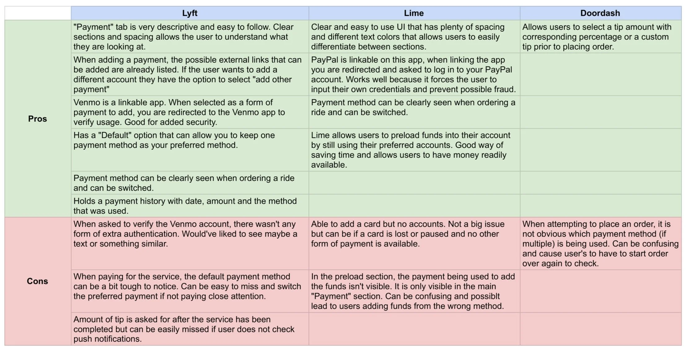
I took a look at 3 different service apps that allowed users to link payment apps such as Zelle and Venmo. I focused on observing their process of linking these accounts as well as the manner by which users are able to select and switch between different payment methods.
Information Architecture
When working on the organization of the information for the added feature, I focused on two tasks: adding the new payment methods to the user’s profile and paying for the service itself.
Adding The New Payment Method
The addition of a new payment method was incorporated to the current design used in the app. The main difference lies within the addition of multiple payment methods. In the current design, only one debit/credit card is able to be added and used as a default payment. For the new feature, payment apps are added as well as their corresponding log in sequences.
Paying for the Service
I incorporated the payment process into the service tab shown at the top of the homepage in the current design. I planned on adding dropdown menus to select a payment method and an option to add a tip, so I made sure to account for that when creating this taskflow.
Wireframes
Once the research was completed and the information was laid out, I moved forward with constructing the wireframes for the two tasks. I focused on integrating my ideas with the current design in a way that was user friendly but also fit seamlessly with the current design.
My Additions To The Current Design
Plus icon to the payment method page
Multiple payment methods
Corresponding card design for each new payment method
Payment app log in
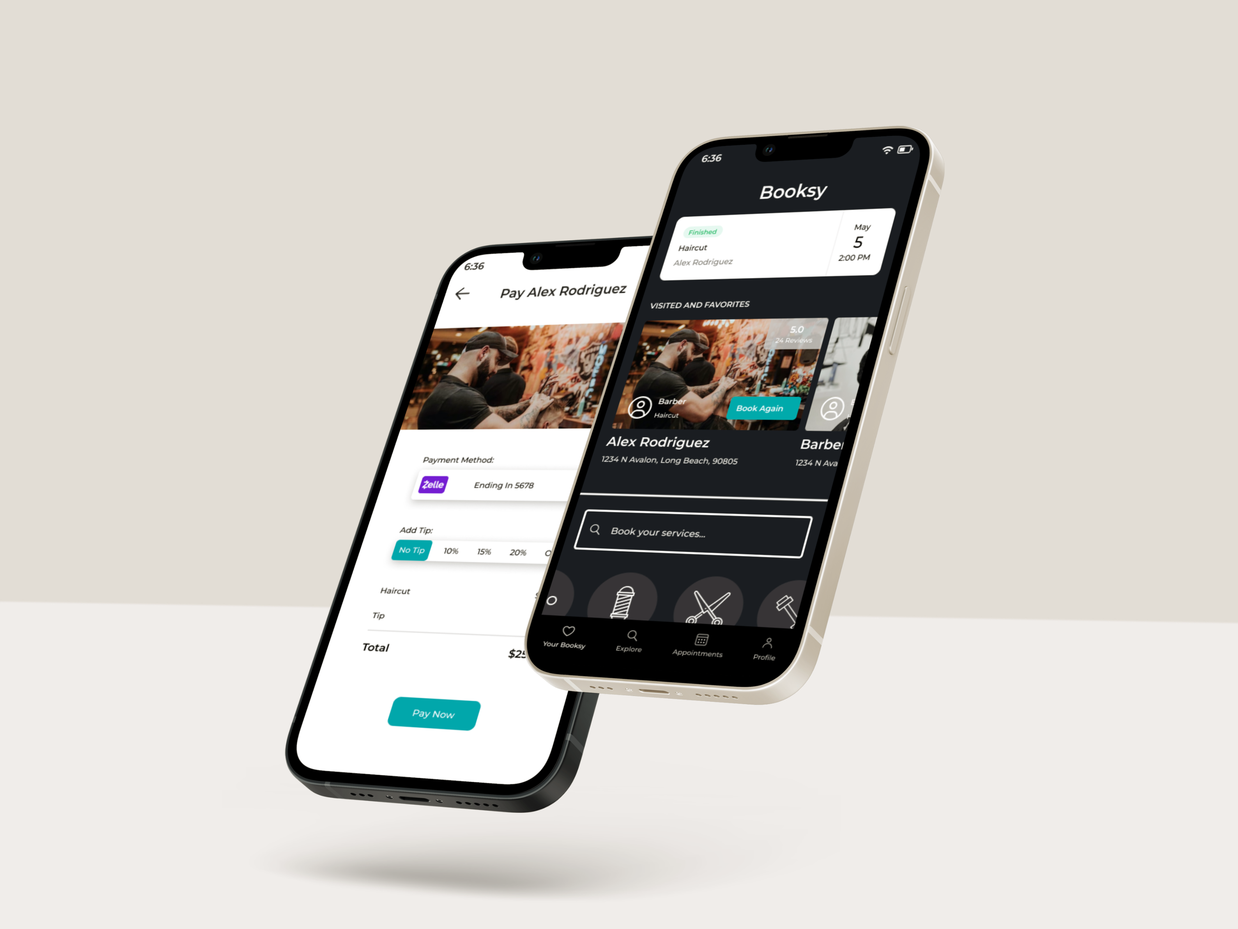
“Pay Now” and “Add Tip” button
“Payment Confirmed” message to service tab
Hi Fidelity Design
Usability Testing
Once the hi fidelity prototype was completed, it was time to move forward and conduct usability tests for the newly designed prototype. 5 potential users were recruited and remote usability tests were conducted. I instructed each participant to perform two tasks: add a new payment method and pay for the completed service. Observations were made, notes were taken and follow up questions were asked to determine the effectiveness of the design and if any possible changes needed to be made.
Task #1
Users were asked to complete the task of adding a payment app to their payment methods. The users had the choice of adding either Zelle, Venmo or PayPal. Each payment app had it’s own login process that was specific to the app itself.
Task #2
For this task, users were asked to complete the payment of the service that was provided. Users were able to select a tip amount if they wanted, and were instructed to use Zelle as their main payment method.
Affinity Map
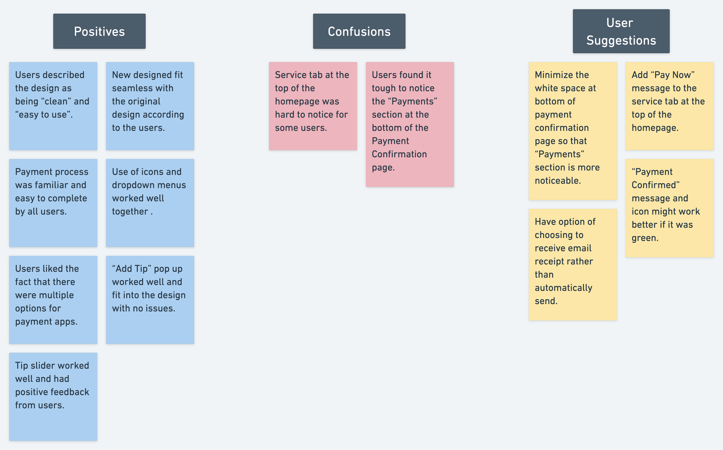
Observations and notes from the usability tests. The tests yielded some very good results and uncovered some pain points that were a bit unexpected. Overall, it was a good collection of information needed to move on to the next steps.
Usability Test Results
Overview
The usability tests generated great results. Each task was completed with only little hiccups in-between. Each user described the added feature as being “simple”, “familiar” and most importantly that it fit well with the original design. The “Add Tip” feature worked well and yielded positive results when used during task #2. Overall, the new feature achieved its intended goal, and allowed users to pay for their service quickly and efficiently.
Although each task was completed, a few pain points were discovered mainly with Task #2.
Pain Points
Pain Point #1: Users had a tough time noticing the “Payments” section at the bottom of the “Payment Confirmation” page. This was important because it is in this section where users are able to view their receipt, and are presented with the option to have their receipt emailed to them.
Pain Point #2: This was less of a pain point but more of a suggestion that was stated by each user. Each user claimed that the “Payment Confirmed” message would work better if it was displayed with a green color. This would provide better feedback to the users and the action overall.
Priority Revisions
Pain Point #1: The white space was minimized within all of the elements of the “Payment Confirmation” page. This allowed the “Payments” section to be more noticeable overall.
Pain Point #2: The color of the “Payment Confirmed” message was changed from black to green to provide more feedback that the task was completed successfully.
Working With The Original Design
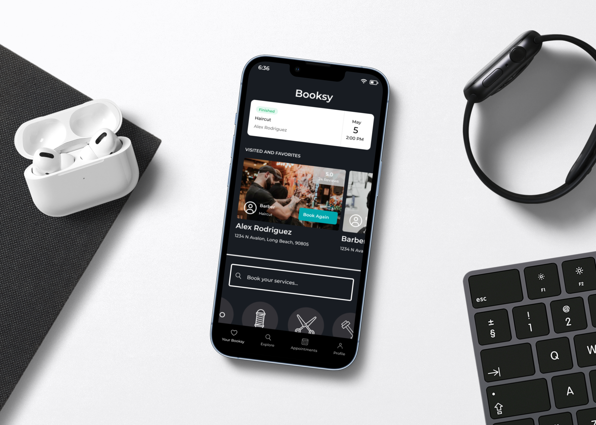
The main issue that came up during the usability tests was that users had a tough time finding the first step needed to complete task #2, which was tapping on the service tab at the top of the homepage. This was unable to be changed due to the fact that it was part of the application’s original design. In order for this to be changed, we would have to speak to the developers and explain why this change is necessary. For now however, we have to stay within the guidelines of the project and change only what we can.
The Revised Prototype
What’s Next?
Revisions and Testing:
The next steps would be to conduct another round of usability tests to determine if the revisions made improved upon the design. We would also need to speak with the developers and explain to them why we need to change the service tab found at the top of the homepage in order to improve upon the overall design and tasks. With more time, I would like to explore the possibility of adding other popular payment options.
Challenges:
This project was tough at times because we needed to make sure that the added feature matched well with the original design. I found myself scrapping ideas at times in favor of those that better fit the overall design.
Making sure the log in process matched for each different payment method. I had to make sure colors and elements all fit well with what those apps currently employ.
Creating visuals like the credit card display was tough and forced me to learn and try new methods.
Final Thoughts:
This project was a lot of fun because it showed me what it is like to work with a product that already exists. I gained knowledge about what it is like to work with certain limitations and how to create a strong design nonetheless. Overall, I truly feel that my skills in research, visual design and testing all greatly improved as a result of this project.
My Other Work
Kingdom Co.
PhysioAide
