Kingdom Co.
Overview
Redesigning a website for a clothing company dedicated to the conservation of wildlife.
Role
UX Researcher & UX Designer
Timeline
8 Weeks
Background
Kingdom Co. is a clothing company that began in 2011. They dedicate themselves to not only providing fashionable clothing designs, but also supporting wildlife conservation by spreading awareness and donating a part of their profits to different wildlife conservation efforts. Their products can be found through their online website, social media and even through retailers such as Urban Outfitters.
The Challenge
Due to several reasons, the team at Kingdom has unfortunately not been able to maintain their online website to the point that they would like. Because of this, the website has gone a while without being updated and has been unable to keep up with the competition.
The Solution
Redesigning the website so that it accurately portrays the brand’s message and products. Creating a design that allows users to stay engaged and up to date with the company’s conservation efforts.
Conducting The Research
Speaking With The Team
I started my research by scheduling a remote meeting with the founder of the company and his project manager. My goals for this meeting were to get to know the team, get to know the brand and gain a strong understanding of what they were looking for in a potential redesign.
Key Takeaways
Maintain the current logos, slogan and story displayed in the “Our Story” section of the website.
Keep the use of a neutral color scheme for the website.
Try to implement a “Find A Zoo” feature that would allow users to search for and find zoos within their area.
Display the information and the products with a design that is modern and aesthetically pleasing.
Analyzing The Current Design
The Landing Page
The landing page works good and provides a good display of the new collection that the brand has just dropped. However, it doesn’t seem to really catch your eye or portray the brand’s message right off the bat.
“Our Story”
The page is very basic and doesn’t do a good job of telling the company’s story in a compelling way.
Product Page
The product page at a glance is not bad and presents the products in a good way. However, there isn’t much else to the page itself. There is no use of filters and some of the categories are incomplete.
Customer Log In Page
Another example of a page that is simple but not visually pleasing in any way.
Usability Tests
Overview
Initial usability tests were ran with a total of 5 participants. I asked each user to tour the website and instructed them to complete a few tasks in order to test the usability of the overall design. I wanted to find out what user’s thought about the design both visually and technically.
Tasks
Tour the website and briefly describe your thoughts on the design.
Begin the process of purchasing an item.
Log in/create an account.
Key Takeaways
Regarding each task, the design of the website worked well and was technically sound.
User’s tended to have more negative opinions on the visual design of the website. User’s claimed that it was “too simple” and not “eye-catching”.
The overall organization of the information and products was confusing, especially on the product pages where certain links and categories were inaccessible.
Signing up for the newsletter was difficult for each user because the link was positioned at the very bottom of each page.
The brand’s message and goal was not evident in the design.
User Personas
Once usability tests were conducted, I constructed two user personas that aligned with information gathered from the usability tests. I made sure to create two personas, male and female, to ensure that the redesign would appeal to both groups. Each persona had different qualities and goals that I felt matched well with potential users.
Competitive Analysis
I completed a competitive analysis on two companies that have similar goals and products as Kingdom. Both of these companies use their platform and products to provide information about wildlife and nature. I wanted to observe how the information is displayed and how they use their brand to portray this message.
Information Architecture
Feature Map
After speaking with the team at Kingdom and conducting the competitive analysis, I created a feature map to display the features that would work well for this redesign, and other features that would be good to add later on.
Accounting For The Timeline
When I originally spoke with the team at Kingdom, they explained to me the desire to build a “Find A Zoo” feature that would allow users to search for and find zoo’s in their area that they could visit. However, after considering the amount of time allowed for this project, I concluded that it would be best to prioritize other features and then add this feature at a later stage.
Sitemap
I focused on creating a design that was organized in a way that would allow users to complete their goals as easy as possible. I wanted to keep the clicks to a minimum, and have the most important information be easily noticeable and accessible.
Taskflow
The taskflow to the right shows the different patterns from which users are able to purchase an item. I wanted to include every possible route, from searching for an item to selecting it from the “Favorites” list.
Wireframes
I wanted to create a design that blended well the important information of wildlife conservation and the aesthetics needed to present the company’s products. I wanted the design to look like a modern online shopping site, while also placing emphasis on the information that deals with wildlife conservation and how users are able to help.
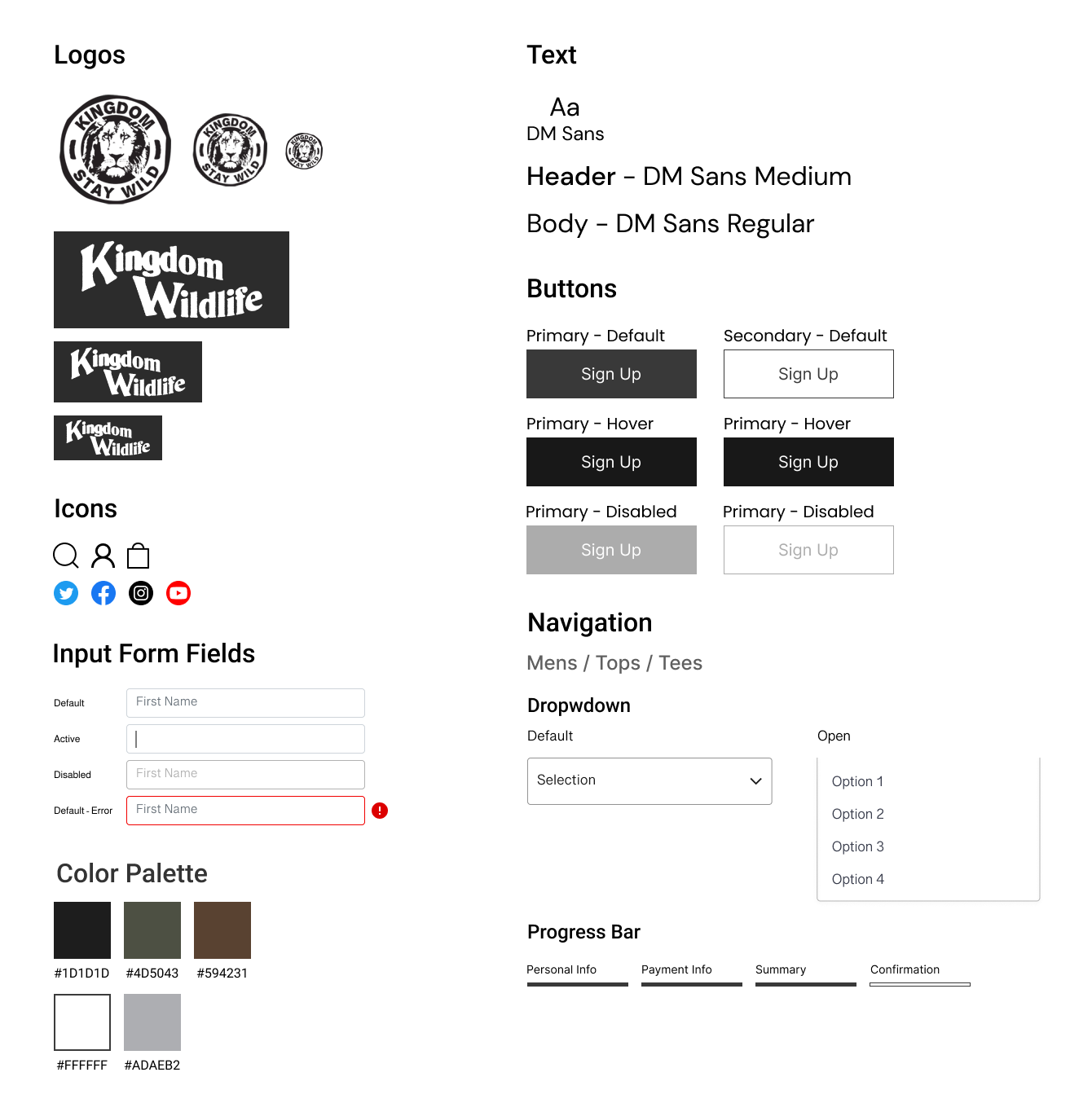
UI Kit
Logos
The logos were provided by the team at Kingdom. I really liked both and wanted to try and implement both into the redesign.
Icons and Text
I focused on using a clean and modern looking font along with recognizable icons. I also wanted to implement the social media links into the redesign, since they use these multiple platforms to display their products.
Color Palette
The team at Kingdom notified me that they wanted to keep the colors of the redesign neutral. But I wanted to also implement different colors that are found in nature through the use of images.
UI Elements
I focused on keeping the elements simple. I wanted to use dropdown menus and progress bars for things like filters, searches and the checkout process.
Hi Fidelity Design
Comparing Designs
Landing Page: Original
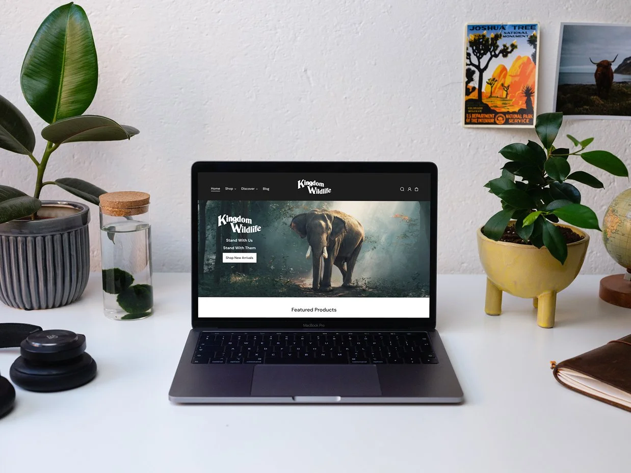
Landing Page: Redesign
Our Story: Original
Our Story: Redesign
Product Page: Original
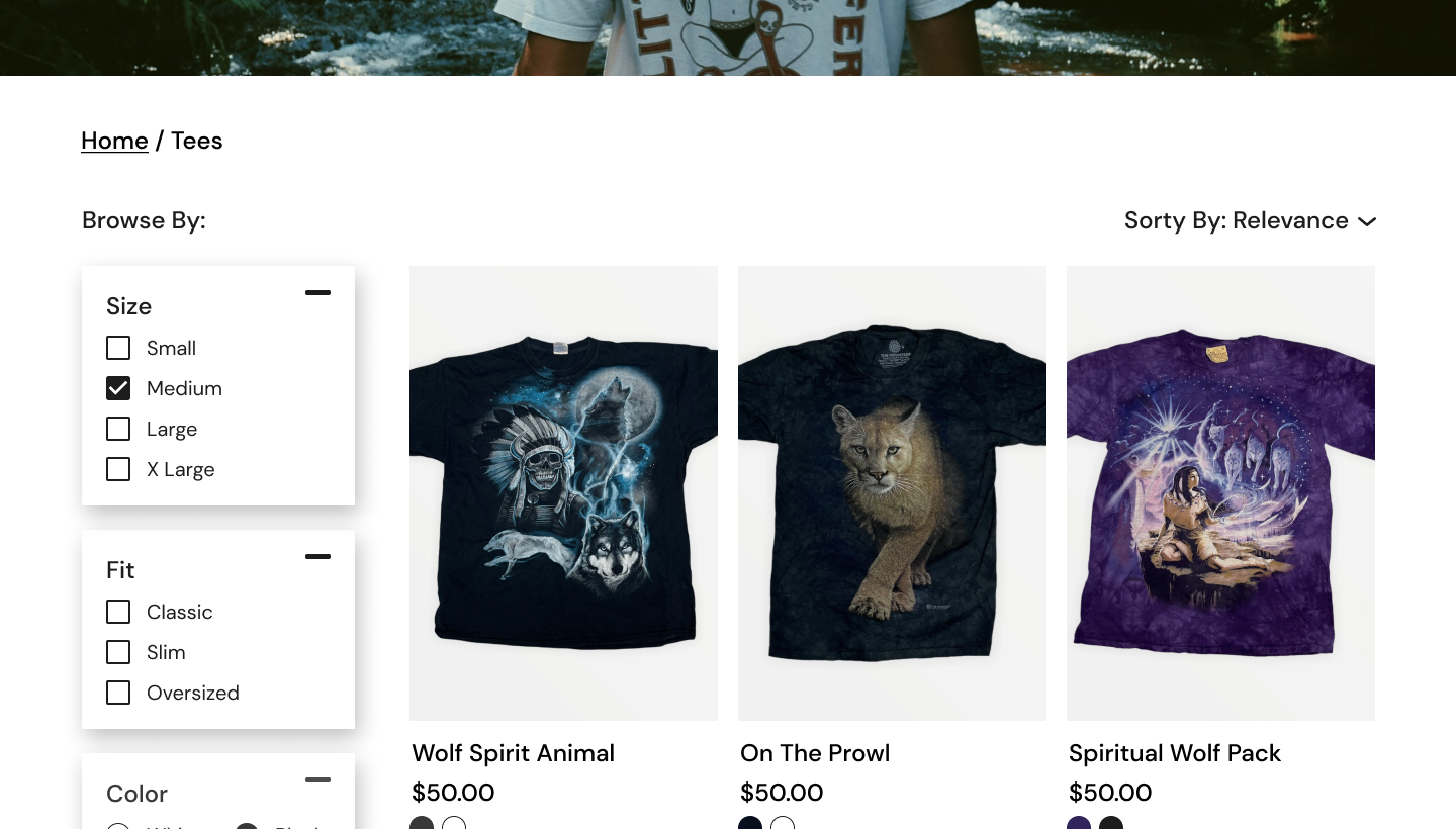
Product Page: Redesign
Sign In Page: Original
Sign In Page: Redesign
Usability Testing
After creating the usable prototype, I moved into the next phase which was running usability tests to determine the effectiveness of the redesign. I recruited 5 potential users and asked them to complete 3 different tasks. I also wanted to test the visual design and determine whether it did a better job of portraying the brand’s message/goal than the original.
Task #1: Asking users to sign in to their account.
Task #2: Asking users to sign up for the company’s newsletter.
Task #3: Asking users to purchase a specific item in a size medium.
Affinity Map
Key notes and observations taken during the usability tests. These were key points that I tackled when it came time to revising the design.
Usability Test Results
Overview
The usability tests resulted in good feedback from the participants. All of the tasks were able to be completed and the redesign was met with positive reviews. All participants stated the the new design did a great job of portraying the brand’s message and balancing it with the products available.
Pain Points
Although the redesign had positive reviews, there were still some pain points that arose during the usability tests. Each task came with it’s own pain point that needed to be addressed.
Pain Point #1: User’s attempted to initiate task #2 (signing up for the newsletter) by clicking on the links in the header first. This flow wasn’t created, so users were unable to complete the task this way.
Pain Point #2: During task #1 (signing in to account), users mentioned that the redesign did not provide enough feedback to show that they had signed in successfully.
Pain Point #3: During task #3 (purchasing an item), users attempted to use the filters by selecting the medium size for the t-shirt. This part of the task was not interactable, so the task wasn’t able to be completed this way.
Priority Revisions
Pain Point #1: I iterated on the design by adding the “Newsletter” link to the header under the “Discover” tab. This would allow users to access the newsletter and sign up without having to scroll down to the original link.
Pain Point #2: I added a green notification to the “Profile” icon to show that users have successfully signed in. I chose this because I felt like it worked best with the current design.
Pain Point #3: I created a task flow where the filters are able to selected and the flow is able to be initiated by clicking on the “medium” size filter.
The Revised Prototype
What’s Next?
Revisions and Testing:
The next steps would involve running another round of usability tests with the newly revised design. I would also create more screens and flows to further expand upon the tasks that can be completed. Once this is all completed, I will present the design to the team at Kingdom in order to acquire feedback. If necessary, I will revise accordingly and continue tests until an error free design is created and handed off to the company.
Challenges:
Working with the team at Kingdom. This was a fun challenge because it taught me how to mesh my vision with the company’'s vision in order to create a good all-around design.
Mapping out the taskflows and being able to create all the routes that users can possibly take to accomplish a task.
Designing the website to successfully portray both the brand’s message and their products at the same time.
Final Thoughts:
I really enjoyed working on this project because it taught me what it is like to work with a company’s team and bring their ideas to life. I was able to be creative with the design while also learning how to portray a brand’s message through the design itself. I gained a strong understanding of the importance of usability testing and how to employ different elements to ensure that tasks are able to be completed. Overall, this project made me a better UX designer than what I was when I first started it.
My Other Work
Booksy
PhysioAide
